Didn't take too long, it's already time to look back on the ghost ship a little bit! Some minor changes and addition have been added here and there, starting with making the globe resemble the world map a slight bit more:
As well as settling for a zone name, which we decided would be The Lost Ship:
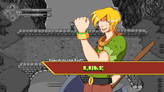
Also been working on a few upgrades to the Luke portrait, featuring a shirt that now more closely resemble his sprite, some anatomy fixes and a bit thicker outline here and there!


So the only thing I can't shake is that I feel like his neck/head is disproportionate to the rest of his body. Everything else looks great but this is only thing I can't help but notice.
ReplyDelete