More WIPs today! Again very short and straight forward - there really isn't that much to this process!

Wall Decor

Starting off with some sketches, as usual!

Apply shading & details...

A wall full of vines/roots.

More bushes!

Sketching out the base for the bushes..

We're gonna reuse & adjust one bush, as well as make a new one.

Placing them out & realizing it'd be cool to have some smaller ones too!

Adding detail and it's done!

The room so far...
And this is pretty much what it'll look like for now! We might go back and add more details later on, but now it's time to jump into changing the season and turning this room into its summer version!


Next week, there might not be many (or any!) updates, as I'm going away to visit my parents for a few days. Posts should be back either by the end of the week, or next Monday. See you then! :D
Today I'll share some more WIPs of some props that will appear in the Temple of Seasons! I'll probably keep these posts kind of short, as the process is pretty much the same regardless of what I work on.


Decorative Thorns

Starting out with a basic sketch!

Creating line art on top of the sketch!

Adding colors and keep on working the details!

Another Bush

Same as above!


Trees
When it comes to the trees, we're gonna reuse (but adjust and upgrade) some of the trees we use in other parts of the world of Grindea:

One of the trees we'll be adjusting!

Refining the edges, improving some textures..

Adjusting Hue/Saturation is the best when creating variations :3 

Tree #1 - Finished!


Today we'll keep looking at that room I'm working on. After we left off yesterday, I added the rest of the grass, as well as some more paths and the water from the sketch. Here's what it looks like now:


Time to start working on those bushes and trees!

To start off, I begin sketching a couple of variations of what kind of bushes I would like to see (and make). I tend to look at some random reference images while doing this, both photos and sprites that other pixel artists made, just to get a feel of how you can approach the leafy texture.


Selecting the sketch I'd like to work with, I then start with color blocking, just to get the base colors down. Then I simply go over the sprite over and over, refining and adding details to the different parts of it as I move along.


Since I haven't been doing any detailed spriting in a while now (I've been busy in portrait- and interface land for quite a while), this was a total pain in the ass and, frankly, took forever! There's no feeling that's more frustrating than when you try to create a texture for something, only to have it look horrible over and over, no matter what you do. Thankfully, after struggling on for a while, things eventually tend to sort themselves out (also, short breaks do work wonders when you get stuck).

Here's the silly bush(es) inside the room:


Now, let's hope I'm less rusty starting the next one! :D
Time to start refining those dungeon rooms! What I like to begin with when doing so is the very foundation of a room: the walls and floors. I like to start with this so much, that as a matter of fact, I finished the suggestion below way back when we hadn't even finished the winter area yet:

Very early version of the walls + floor!
As it turns out though, applying textures you create in a small mockup window to an actual room doesn't always end up the way you expect it to. The textures looked horrendous together when they were repeated over and over! Way too much stuff going on, making my eyes hurt big time.

Ugh! My eyes! My eyesssss..!
And not only that: the colors also proved to be an issue. Since this is the autumn version of the room, naturally the props will have a lot of yellow, orange and red colors. However, since the walls and floors are already in very similar, vibrant colors, the props will pretty much blend in and most likely only serve to make the room feel even messier.

So: we quickly decided that not only did we have to cut down on the textures, we also needed to tone down the colors.

Here's a very quick new version where I applied softer colors, and simply removed the floor texture for the time being:


Moving on, I started to sketch out the props we needed again, this time in color, to see whether the result would be harmonious or not. However, I wasn't sure what do do about the floor.

I had a couple of different ideas: either the floor would continue to consist of simple floor tiles, this time in a less hypnotizing pattern, OR the floor could be some kind of dirt instead, giving the dungeon a more natural feel:


As I showed the sketches to Fred and Teddy (they're amazing for understanding even half of what I mean with sketches like these) I came up with a third idea. What if the floor wasn't that type of floor at all, but grass and nature altogether, similar to what we use in our outdoor areas?

I quickly made a sketch of this as well, showing it to my colleagues:


In the end our reasoning was that the more nature we could squeeze in, the cooler it would make the dungeon and the rooms. My job now was to create this floor (and its paths) to see how it'd work in actual graphics and not just very unclear sketches. Starting out with the middle part of the room, here's my take on the floor using the grass-sketch as my "guide":


Obviously, I haven't made any props to go with it yet, but so far we're quite happy with the design, and it's likely this will be the type of floor we'll be using in the dungeon.

What do you think? Yay nor Nay to more nature in the dungeon? :)
Before jumping back into the Temple of Seasons showing sprite WIPs and whatnot, I thought I'd bring up another thing we're working on when it comes to the Skills- and Talent systems.

One thing that has been on our mind for the longest of time is how (or if) you're supposed to be able to respec your character in the final game. Our ideas have ranged from allowing people to respec at any time, to only be able to do so once, to doing it at a NPC for a high gold cost, etc.

Now we've finally come to some sort of decision that we'd like to try out, so it'll get implemented in a future update for you guys to beta test.

The Refund button in action!
What we're doing is adding a button called 'refund' (the term isn't exactly correct, but bear with me) to the menu that appears when you select a skill or talent. Using this button will bring you to an interface where you will be able to select if you want to refund one point or refund all points that you've spent on that very skill (or talent).

The drawback is that in order to get your points/orbs back, you will need to sacrifice some gold, which will increase with your level and the amount of points/orbs you wish to refund.

Since I'm in charge of making the GUI-art, I already started working on this (quite simple) interface a while back. It all starts with a sketch:

10/10 art, would draw again
As you can see, the sketch shows three buttons - the third was supposed to be a 'cancel' button, so you wouldn't panic if you forgot how to back within the menu. However, making the rendered version of the interface, we realized it was taking up too much space, and made the whole box look much less attractive. (Besides, you always have tooltips at the bottom of your screen to remind you how to back, if you should forget it for a moment..)

So we did away with that, and settled on only having two buttons, which you can see the progress of here:


Also, yes, the title is very WIP. No idea what it'll be called in the actual game! But we do look forward to hear what you think about this system and how it works out once it's implemented :)

Oh, and since we wanted each Talent page to have the same amount of talents to choose from in the beginning (General had 10, Melee 8, and magic 7), we decided to fill out the Melee and Magic pages with a couple of talents that you suggested over in the Secrets of Grindea forums! The icons can be seen here:


Quick Warning: These posts will feature details on what the Temple of Seasons could (and probably will) look like. If you want to experience the dungeon without knowing the layout beforehand, you should probably only read this post after it has been implemented and you've actually had a chance to play it!

The last post ended just as we were about to jump into the game. Teddy had implemented each room-sketch and connected them the way they're supposed to connect, so when we run though the dungeon, we get the 'correct' experience (except for the fact that everything is simple sketches and there are no enemies or things to interact with, of course).

Here we are, running around in the lobby room:

Running around in sketch-land!

Many different things become apparent when we run through the rooms this way. Sometimes I've overestimated (or underestimated!) how much space is needed, sometimes we come up with new layout ideas that are cooler than the old ones. Sometimes an entire design just feels wrong, and has to be scrapped!

With the lobby, there was one major thing I hadn't considered when I made the sketch. In the room you're supposed to change the season a few times times in order to open up new paths. Thing is, when I made the design, I didn't take into consideration that it's probably a good idea to be able to see what change you make (which new path open, and which one closes) when using the season change-orbs.

If we take a look at the original sketch, using the camera mockup to aid us, it becomes clear that you're not gonna be able to see all changes when interacting with certain orbs (the red x shows where the changes will happen):

Camera mockup to the rescue!
To correct this, I shrank and edited the sketch a bit so you'd be able to see everything. Teddy put the new sketch into the game and tried running around the room again:

Version 2

Well, now there's a new problem - the room feels too small and boring! Time to return to the sketching table. After several iterations adjusting both size and layout, we finally came up with a version we were happy with. Here it is in the game:

Finally, it feels alright (if only Naniva could get away from my face).
This is just one example of how we iterate rooms before actually making graphics for them. In order to know how big props and set pieces need to be, we need to know how large the room is gonna be and how much space the prop/set piece should take up within it. Either that or we'd have to guess or randomize sizes, which I'm sure would lead to less desirable rooms overall.

So basically, this is how we spent this day. Fine-tuning and adjusting rooms until they all felt nice. There are still two rooms we haven't decided on yet (we'll save them for later, not quite sure exactly will happen in them yet), but aside from those we're more or less ready to start making actual sprites for the dungeon! Wohoo!

Bonus: Another before and after on a room we changed!
And so, this ends the final part of the 'Designing a dungeon' series. Now you know our approach to the process!
Quick Warning: These posts will feature details on what the Temple of Seasons could (and probably will) look like. If you want to experience the dungeon without knowing the layout beforehand, you should probably only read this post after it has been implemented and you've actually had a chance to play it!

This is where the fun begins, at least if you're me! It's time to take the first step of actually creating art for the dungeon. But we're not instantly jumping into spriting - no, first we have to go through a series of steps to ensure the rooms are the 'right' size. 

So what is the right size? Well, obviously, it's when a room isn't too big nor too small! Easy, right? .....Perhaps not so much. 

What we do to make sure the rooms in our dungeon work well is to make a quick sketch of the room, including the kind of decorations and props we'd like to see in it, and put that sketch directly into the game. Here's an example of how I took one of the rooms from yesterdays very basic map, gave it some more realistic proportions and sketched the kind of environment we'd like to see in it: 


The basic "map" version (left) translated into a sketch w/ more detail. 

When I make these rooms sketches, I use a 'camera template' which shows exactly how big the camera is and where your character is in the middle. It also indicates where the GUI appears in the game, so I know exactly how much space I need to have above the walls and doors to make sure the HUD won't cover anything important:


The Camera mockup-thingy helps a lot!

Since there's quite a bunch of rooms, sketching out all of them can take a long time, and I believe it should! Even if I'm not making any final art at this stage, I try to think hard about what kind of set pieces and random props I want to use in the room. Some other, quite important questions to consider are: Is there enough space for my character to run around? Where can I battle enemies? Is there too much space that has no real use?


A couple of different room sketches.

I'm sure glad we take a break for dinner in the middle of the day, because after too many hours of trying to come up with interesting designs, my creative juices tend to run dry! Especially when it's a dungeon such as this, where I have to stop sketching every once in a while to discuss what kind of obstacles we want to use for each change of season, and how the rooms should change depending on what season it is. There's a lot to think about, so it has to take some time. 

In the end, it took almost the entire day to finish sketching the rooms and their decorations. Once they were done I handed them over to Teddy, so he could connect them and put them into the game. The next step is to run through the dungeon alone and in multiplayer, with only the sketches and our imagination to guide us. Then we'll ask the same questions I asked myself when sketching and adjust the rooms accordingly. 

But that will be tomorrow's post... :) 
Quick Warning: These posts will feature details on what the Temple of Seasons could (and probably will) look like. If you want to experience the dungeon without knowing the layout beforehand, you should probably only read this post after it has been implemented and you've actually had a chance to play it!


First version of the final design!
Yesterday we ended up with a very basic sketch of what we wanted the dungeon to look like. We had a couple of rooms decided, and some places where we knew we needed some basic battle rooms, puzzle rooms or a combination of rooms where you have to use your season change skill.

Today we went on to decide what we wanted in those undecided rooms. We brainstormed puzzles and ways to use the season change skill that would be challenging and interesting for the player.

Now, we didn't come up with all of this in one day. Some of the puzzles and challenges are stuff we came up with weeks or even months ago - ideas that came to us when we were thinking about something else, but didn't quite fit what we were working on then.

(On that note, I encourage anyone who works with game design, writing or any other creative job to save your ideas! Even if the idea or design doesn't work with what you currently have, it might be a perfect fit for a later project - so write it down somewhere and save it for later!)

Puzzle ideas in the making.
After making some minor changes to the initial design so it would better fit our puzzle and challenge ideas, we finally settled for a room-by-room sketch that we'd like to work with.

Next step: bring the sketch into the computer and clean it up!
The line art version.

At this point, I don't take proportions into consideration - all I want is to be able to see the rooms and how they connect clearly. Once we're making the actual rooms for the game, we have to test and tweak each and every one of them individually so we know they're the right size and don't feel weird, so that's for a later stage. For now, it's all about the line art.

Once I have it in place, I go over each room again and put out all the height differences, chests, obstacles and any other stuff we may have decided on when we made the more detailed sketches. Again, this is just to create a very basic map of which room goes where, and how to get from one room to another - the details and proportions are saved for later.

This is what we have in the end:

Temple of Seasons interior design (so far!)
Tomorrow it's time to start looking at each individual room, sketch decorations, and prepare to give it all a test run!
Quick Warning: These posts will feature details on what the Temple of Seasons could (and probably will) look like. If you want to experience the dungeon without knowing the layout beforehand, you should probably only read this post after it has been implemented and you've actually had a chance to play it!

Now that most of the Talent stuff is out of the way (at least, my part of it), it's time to move on and take a look at the next step on this journey: the next dungeon/temple/whatever you like to call it!
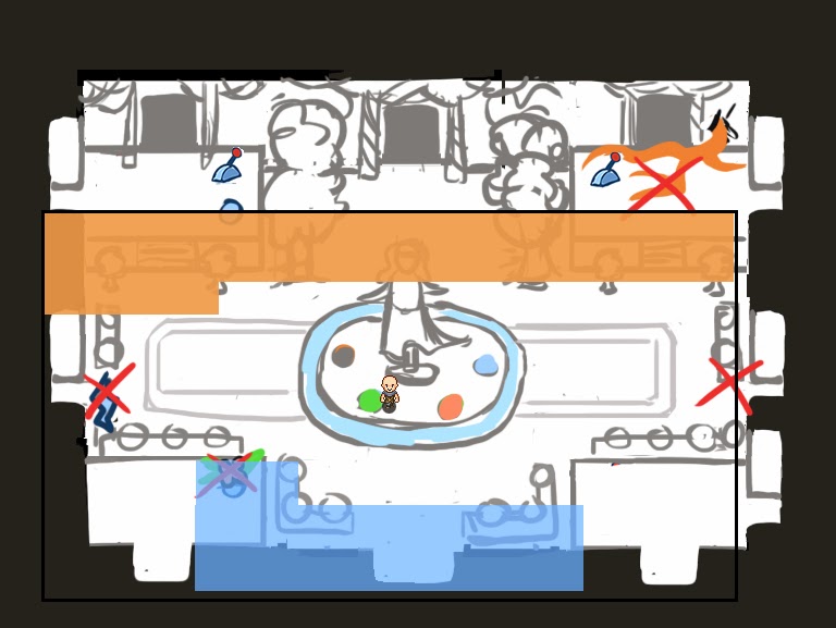
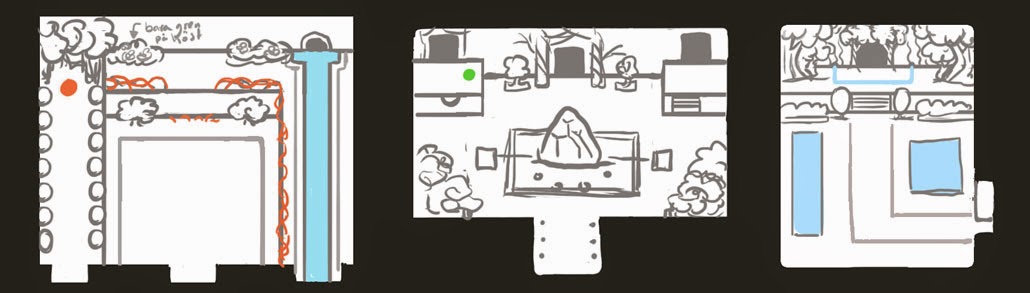
Time to sketch! Yay!

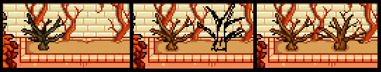
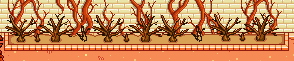
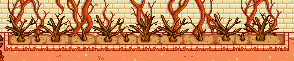
The theme for this dungeon is the change of seasons. As such, you will have the ability to (at certain points) change what season is dominating a room. We've shown a couple of enemies over in the devblog way back, so as you can tell we've already started working on the overall concept.

What we haven't worked on yet is the actual design of the dungeon. Like, what will the rooms look like? Where will the mini-boss(es) be? What kind of puzzles do we want?

The process of designing this is pretty messy, but it gets the job done. To begin with, we all sit down on the office couch and make a list of things we know we want. In this case, that meant some kind of lobby room, a very easy introduction to the whole season change-mechanic, and a very early fight which results in you achieving the ability to change seasons.

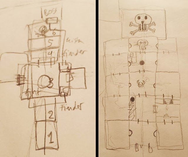
Once we know the basics of what we have to work with, each of us make a quick and dirty sketch of what we'd like the dungeon to look like. Now, we're not talking room-detail level here. We're basically talking shapes. The Flying Fortress, for instance, is basically a very fat upside down T-shape. You start in the middle, then go first to the right and then to the left, before returning to the middle and going up the T-shape to the boss.

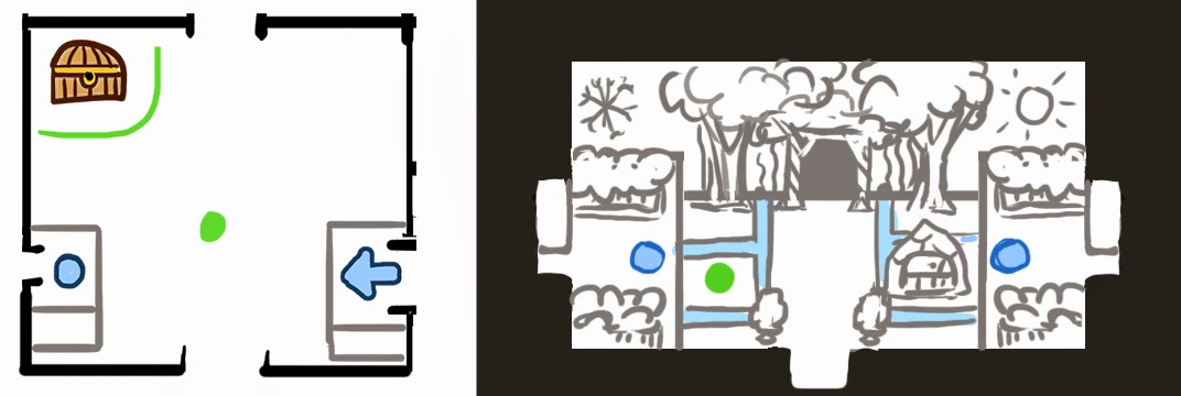
Flying Fortress with its 17 rooms
Using shapes like this in our initial design helps us keep the design straight forward and easy to understand, while also making sure the rooms don't come all in one straight line, which would be too basic.

While we're messing around like this, we tend to get some ideas (on a more detailed level) of what we think would be nice to see in the dungeon. When I was talking to Fred, he mentioned it would be cool to have some sort of main room which you returned to multiple times, that linked the different parts of the dungeon together. I thought this sounded interesting, so while he went on to explore other ideas, I decided to see where I could go with designing such a room.

In the end, Fred and I came up with two different sketches, both boiling down to one basic concept: that you'll pass through rooms and see things in them that you can't yet reach, only to return to them later and use the season change skill to open new paths.

Early Sketches
In one sketch the temple rooms worked like a grid, where you'd visit the same rooms multiple times through different doorways, while another used one main room as the big connection-point, with multiple doors leading out of (and into) it. Following one door would lead you to a set of rooms which eventually would lead you back to the big room, but through one of the doors that you couldn't reach before. In the end, the latter one is what we decided to go for.

So now we basically know where all the important rooms are. What we have left to do is to design puzzles and room combinations that lead you between those rooms, and that will probably be what we'll focus on tomorrow. Once we're done with that it'll be time to whitebox the dungeon - but I'll save that part of the design process for another post, I think :)
Magic Talents! They are kind of few right now, but there will definitely be a whole lot more in the future. 


As always, these talents are subject to change, and there will definitely be more added later on! Also, all titles are working names only, and while they all seem to be maxed out at lvl 5 on the screencaps, this will not be the case in the actual game.


Intelligence
Increases MATK by 2% per level.


Arcane Charge
After using a magic spell, your next normal attack will do [20%*Spell Charge lvl] damage per level.


Prismatic
After casting a magic spell, casting a second spell of a different element will cost 15% less EP per level.


Battle Mage
After casting a magic spell, casting a combat skill will cost 20% less EP.


Turtle
Increases your DEF by 10% per level when charging a magic spell.


Last Spark
When your HP is below 20%, you'll gain 20% MATK per level.


Arcane Collar
Decreases the EP cost of summons by 2% per level.
Next PostNewer Posts Previous PostOlder Posts Home